Cafe at 407
A Kiosk Design For a Café With a Cause
Performed a UX evaluation of Café at 407’s ordering workflow and designed a kiosk-based solution that streamlined the ordering process and minimized friction points for customers.
Role
UX / Product Designer
Software
Figma, Illustrator
Timeline
3 Months (Concept Work)
The problem
Café at 407's single register created chaos during peak hours
Long lines made customers uncomfortable, the queue backed into the seating area, and staff couldn't keep up with demand.
Long Queues
15+ customers waiting in line to order during the busy hours.
Space Constraints
Limited space caused crowding and discomfort for seated diners.
Staff Bottleneck
One cashier handling orders, payment, and customer questions.
The cause
Where every order funds eating disorder recovery
Café at 407 donated all proceeds to Ophelia's Place, a local organization supporting healing for those with eating disorders.


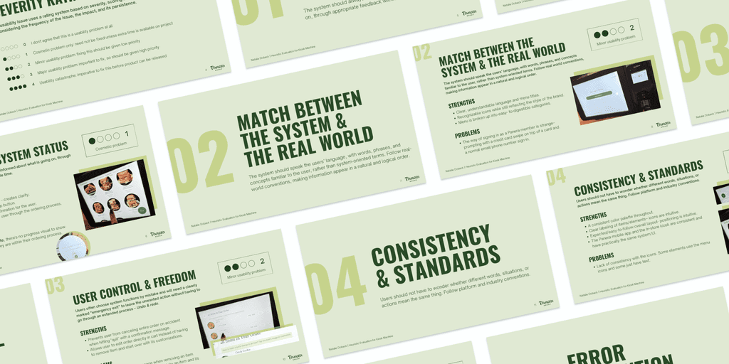
Heuristic Evaluation
Starting with what already exists
I began by evaluating an existing kiosk experience (Panera Bread) using Nielsen’s heuristics. These insights shaped the kiosk’s structure before I touched layout.
Research
Understanding the customer experience
I observed customer behavior during both peak and off-peak hours to understand the crowd patterns, service speed, customers during different times of the day.
Finding #1:
Most orders were simple grab-and-go items that didn't require staff interaction.
Finding #2:
Customers seemed comfortable with technology (the existing iPad POS system used for checkout).
Finding #3:
The reasoning
Why implement a kiosk?
Fast to use
Uses familiar patterns from devices people use daily, eliminating the learning curve.
No staffing increase
Small tech investment, then the self-service model eliminates additional staffing needs.
Client comfort
Minimizes any stress/discomfort some customers might experience when ordering food.
Mapping the Experience
Before designing screens, I mapped out the entire journey
The menu browsing, customization, cart review, and checkout - Establishing the backbone of the project and ensuring every screen had a clear purpose.
The kiosk in context
Designing for the space, not just the screen
Before placing a single element, I had to understand how the kiosk would live inside the café. Where would customers naturally stop? How would the line form? Would it block seated diners? The kiosk couldn't just work on screen - it had to work in the room.


In-person observations revealed how the kiosk could be integrated into the space without disrupting the existing flow of things.
Kiosk placement
The unused side of the bar provided a natural surface to house the kiosks - no structural changes needed.
Wait area
The overflow seating, already separate from main dining, would give customers a comfortable place to wait.
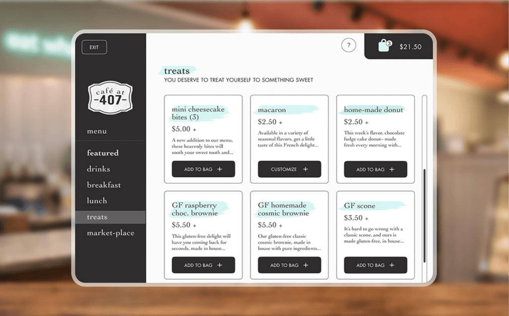
The visual logic
A kiosk that felt familiar
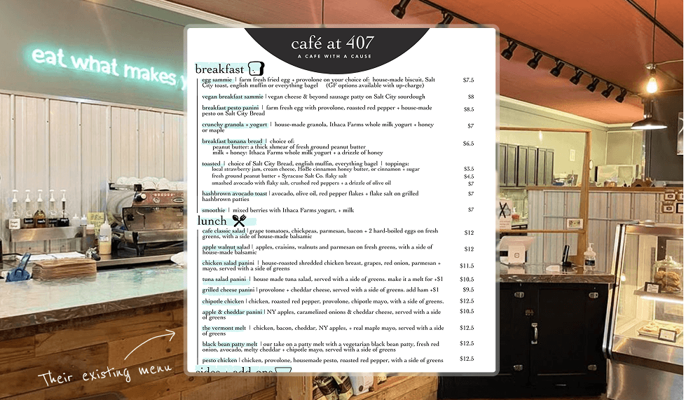
The UI was designed to mirror Café at 407's existing menu design - same visual language, same hierarchy. So when a customer stepped up to the screen, it already felt like something they recognized.
Prototyping
Designed before Figma components and variables existed
What this gave me
deep control over each state
forced clarity in decision-making
strong understanding of interaction sequencing
What it limited
rapid iteration
scalable updates
real-time usability testing
To create a realistic experience and make the flow come to life, the kiosk was prototyped frame-by-frame. At the time, this was the only way to simulate a complete system.
reflection
Feedback, without formal testing
Throughout the project, I gathered ongoing peer feedback via walkthroughs, critiques, and iteration based on observed confusion.
This helped refine flow clarity, but it also surfaced a major gap.
Feedback is valuable.
Observing real users reveals what feedback alone can’t.
The missing piece (and why it matters)
Because of tooling constraints and the frame-by-frame build, this project did not include structured usability testing with real users completing tasks.
That absence became one of the most important lessons of the project.
Thanks for being here
Want to know more?
Feel free to dive deeper by looking through the process doc - all 106 pages of it, which should tell you just how much heart went into this project :)

