Trakz
Built for Safety and Peace of Mind Outdoors
A real-time tracking app concept that provides hikers, runners, and adventurers with live location updates and immediate emergency alerts.
Role
Product Designer
Software
Figma, Adobe Illustrator
Timeline
6 weeks (Solo project)
The problem
Existing tracking apps fail outdoor users when they need them most
Apps like Find My lack comprehensive emergency features and fail in poor-coverage areas. There's no simple way to share trip details, set check-in times, or quickly access emergency services in remote environments.
Key Insight • Competitive Analysis
After analyzing Cairn, the main competitor, I saw that while the concept is strong, the design had notable shortcomings - unclear branding, text overflow, cramped margins, and inconsistent visual polish.
This revealed an opportunity not just to match features, but to make a trustworthy experience that creates confidence in high-stakes situations.
Research
Understanding the outdoor adventurer's journey
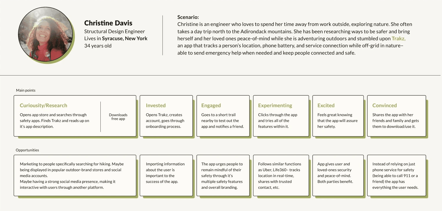
Evaluating three different user personas revealed opportunities to tailor the app experience to Christine’s unique needs and preferences.
Research
Establishing design principles
Clarity over complexity
Emergency interfaces must communicate instantly. In high-stress situations, every second counts.
Trust through polish
Visual refinement builds confidence. Users must feel certain the app will work when their safety depends on it.
Proactive safety mindset
Encourage users to plan for safety before problems occur, not just react to emergencies.
Design process
From concept to high-fidelity prototype
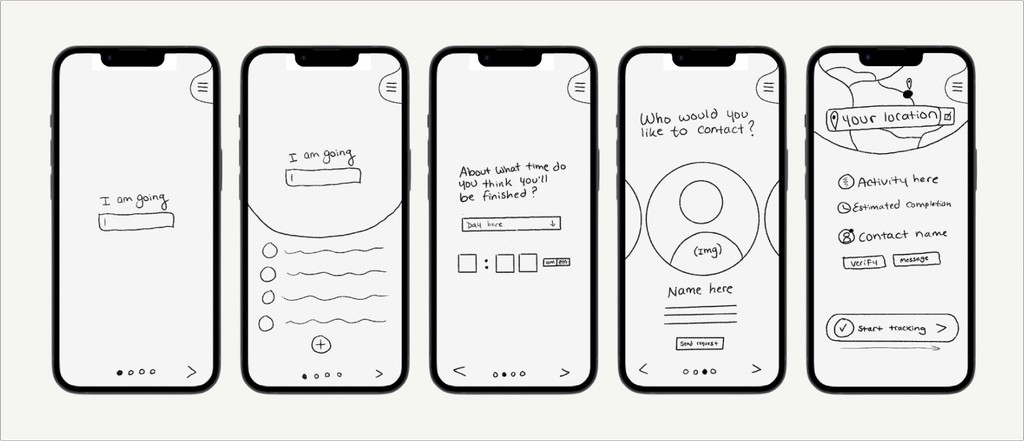
Initial sketches and wireframes revealed confusion from similar screens and unclear emergency access. The second iteration consolidated flows, simplified the UI, and made the SOS button persistently accessible with strong visual prominence.
Solution
Four core experiences
01. Onboarding
Introduces core functionality while collecting essential safety information. Builds confidence before users ever start a trip.
02. Quick Trip Setup
Profile setup happens once. Per-trip data takes only 3 screens. Start tracking with one tap using saved defaults.
03. Active Tracking
Real-time map view with trip progress and contact visibility. Help section provides value even when not tracking.
04. Emergency SOS
Persistent red button provides quick status messages or full emergency escalation. Prevents false alarms while maintaining instant access.
Final Compositions
App Onboarding
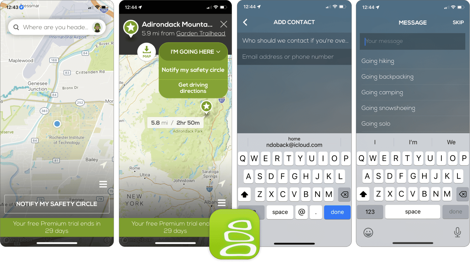
Onboarding is the first experience for new users, quickly introducing the app’s main features and helping them understand how it works.

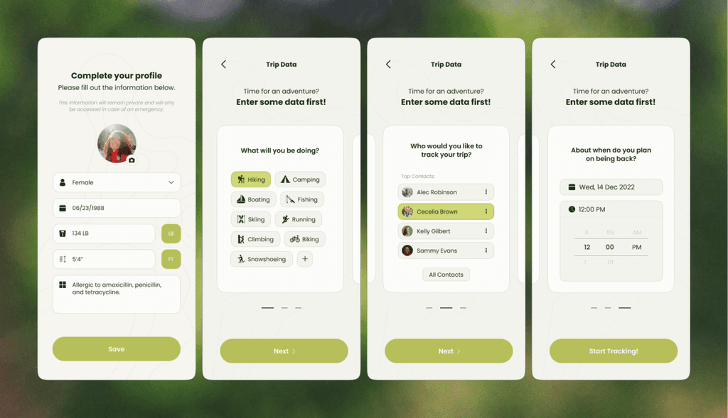
Trip Onboarding
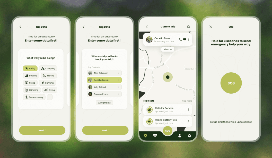
Trip onboarding collects details about the trip a user wants to track. New users first complete a profile setup (also accessible later in settings), while trip details are entered each time a new trip begins.
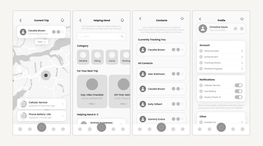
Main Screens
The primary screens are organized within the bottom navigation, allowing quick access to core features. Most sections are interconnected and share data, while the Helping Hand page remains a standalone resource.

Emergency SOS
The SOS screens are designed for speed, enabling users to contact emergency assistance and dispatch help to their location.

Prototype
Created in Figma using frame-by-frame, prior to the introduction of components and variants.
Impact & Reflection
Key insights & takeaways
Context-driven design is critical
Introduces core functionality while collecting essential safety information. Builds confidence before users start a trip.
Polish builds trust
Profile setup happens once. Per-trip data takes only 3 screens. Start tracking with one tap using saved defaults.
Future Opportunities
The scope of this project prioritized establishing a clear, reliable core experience, leaving areas such as field validation, offline infrastructure, and service partnerships for future exploration.
Next steps would include real-world user testing and expanding the app with additional tools like route, weather, and community data.
Thanks for being here
Want some more details?
Feel free to dive deeper by looking through the process doc!

